People often say, “do not judge a book by its cover.” While this timeless expression is excellent advice for both adults and children, it is possibly the worst piece of advice to follow in website design.
In a recent study conducted by Stanford, 75 percent of website visitors judge the credibility of a business on how its website is designed.
People do not trust poorly designed websites. If your website’s design is poor or the information looks outdated, they will not trust your website.
They may view your site as shady because you do not have an updated web design and leave immediately. You need professional-level help to build a better website for your business.
A custom NYC web design company has the power to create an effective, innovative website design that captures your brand and improves your conversion rates to help grow your business.
If you are on the fence about hiring a top web design company, remember that people spend most of their time online, so being found online is key to building a successful business.
So, staying up to date on the latest trends is crucial to ensure your websites stand out from the competition and make the right first impression.
To make things simple, let us look at the top website design trends for 2022. Let’s dive in.
1. Dark Mode

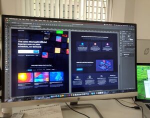
From Apple’s OS to Google’s search engine, dark mode is a trend in the tech world and web design. Dark mode refers to website design that uses a low-light interface of darker colors such as gray and black as the primary background.
The concept of dark mode has been around for a while, although it has only become popular recently. Some of the world’s first website designs used dark mode to prevent fatigue for coders who spent lots of hours looking at a screen.
The dark mode designs have gained popularity due to internet users’ increased time spent looking at their desktop and mobile screens.
The main benefits of using dark mode design are making highly visual websites look great and also allowing your website users to have an easier time focusing on CTAs or images.
The dark mode is typically associated with power and elegance, making this a significant trend for minimalistic designs.
2. Retro-Inspired Design

From website to clothing designs, retro-inspired design has made a big comeback in 2022. These website designs use older style images, colors, fonts, and layouts to create a great user experience for website visitors.
From old-school Victorian era-inspired designs to 1980s-themed designs, website designers have the freedom to take visitors into a different time era with this trend.
Since retro-inspired designs play on the emotional connection visitors will have with the represented period, the main benefit of using this type of design is increasing conversions through emotion.
3. Interactive 3-D Elements

Incorporating interactive 3-D elements into your website design will make your design stand out from your competition. 3-D web designs place objects along your website’s x, y, and z-axis, giving the appearance of that element popping out of the screen.
When compared to traditional 2-D designs, 3-D interactive website designs can create more engagement from visitors by providing them with a truly immersive experience.
Also, 3-D interactive elements allow website designers to bring anything from eCommerce products to real estate properties to life with a 360-degree view.
This often leads to improved conversion rates becausee visitors will better understand the products or services that the website is promoting.
4. Split-Screen Websites

Split-screen websites can be a great way to turn up the heat for web pros looking to spice up their designs. Split-screen is a website layout design that divides the landing page or homepage into two or more vertical parts. This design allows separate diverse messages or content to be on the same page.
As the ultimate A/B testing website design, split-screen websites help website visitors to follow the part of the website design that appeals to them the most.
One of the primary benefits of using the split-screen design is to draw visitors’ attention to the desired element, such as a product image of CTA . Since many websites still do not use this unique design, it is an opportunity for your website to stand out against other minimalist designs.
Split-screen design is best for websites that do not have extensive content because having many content can make the design look too cluttered. Take advantage of split-screen website design to create a new responsive website.
5. One-Page Websites

Like landing pages, one-page websites are becoming increasingly popular in 2022 due to their fluid user experience and simple navigation.
Compared to multi-page websites, one-page websites tend to have a higher conversion rate because messaging is more direct and concise than in a multi-page website.
One-page websites are best used for small businesses, freelance portfolios, or visually driven content since these designs rely on simplicity to relay CTAs and necessary information.
Also, one-page websites can be great for improving mobile-friendliness and highly beneficial for increasing user engagement.
6. Virtual Reality

From video games to websites, virtual reality design has gained much traction in 2022. Virtual reality gives your website visitors a sense of exploring or experiencing their surroundings in real life.
Some of the benefits of virtual reality design are to awaken visitors’ interest and leave a lasting impression of the services or products that you provide.
Also, virtual reality design allows you to build a stronger brand identity and convey a more powerful message.
Common use cases for virtual reality design include showcasing what clothing or makeup would look like on a customer, how products would look in your home, or what an apartment looks like without physical inspection.
7. Text Only Hero Images

Hero images have played vital roles in a website’s ability to grab a visitor’s attention, strengthen website navigation, and inform visitors what the website is all about.
Typically, the hero image contains an illustration, a photo, or 3-D graphic. But with this trend, website designers use bold, oversized text instead of an image to grab a visitor’s attention.
Some of the main benefits of this design approach are getting the visitor to act quickly with vibrant copy and making the text more appealing through a stunning visual display.
This popular new way of creating hero images allows designers to have the text make a statement instead of pictures or graphics.
Conclusion
Like everything, web design trends constantly evolve, and new ones arise daily. While there are lots of other great website design trends to implement in your website builds in 2022, these are my favorites.
Keeping up to date with what is popular in the industry will position your website to keep your customers and potential customers engaged and to keep coming back for your goods and services.
But the most important thing to remember is to design a website that is right for your content and audience.
